Three apartment moves in three years means three rounds of designing my home for a new space; three rounds of scrolling through glossy inspiration images and screenshotting them into mood boards; and three rounds of staring at all these images and trying to discern what I like, if it fits into my new space, and how to source it. Was that a sideboard or a credenza? Was that Japanese minimalism or Scandinavian mid-century modern?
This was the core problem, and potentially unique differentiator, around which I wanted to build The Find - how do you translate visual taste into structured, searchable language (and ideally sourced items, but more on that to come in a future post)? Given AI’s ability to extract patterns and parse images, I thought this would be a great test case to see how well it could tackle a subjective, taste-driven task.
Before diving in, one quick note: I decided to call the structured output from the model the “Design Soul Doc”, inspired by the “soul document” that was discovered to be the guiding principles underlying Anthropic’s Claude 4.5 Opus model; it seemed apt for describing the core properties of the images and you’ll see it referred to quite a bit here.
Generating the System Prompts
Given that this was such a foundational piece of The Find, I decided to run two agents - Gemini & Claude Code - in parallel. I provided each with an overview of the app’s vision and a basic prompt, then compared the outputs to see which model generated a better System Prompt that would guide image analysis in The Find. The semantics get a bit tricky and meta here. We are prompting models to generate a prompt. I’ll use System Prompt moving forward to refer to the output that powers The Find.
One thing I noticed straight away with the System Prompts themselves: the models were able to pretty effectively translate values that I provided (i.e. expert opinions and vintage finds over mainstream big-box stores) into specifications (for example, Gemini prioritized architectural era, materiality, “high-low mixing”, and niche sourcing). This was an early signal to me that perhaps they’d be better than I thought at this subjective task.
The Eval Setup
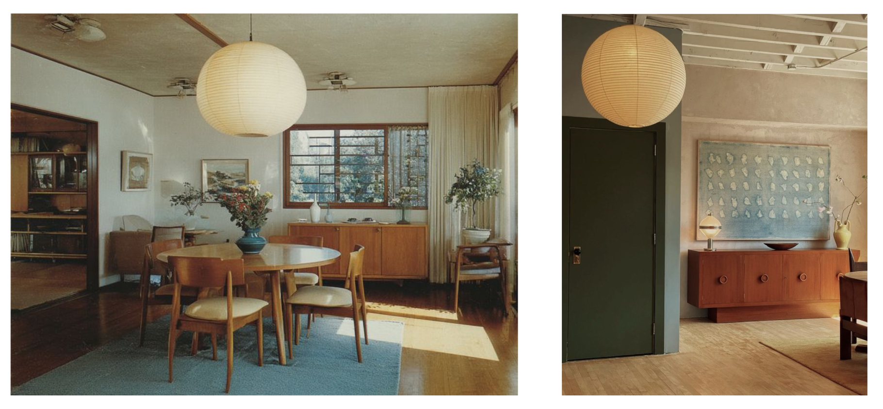
For the purposes of this post, I re-created my experiment using 1) the initial System Prompts I got from Claude Code and Gemini, 2) Claude Console’s Workbench to actually run the System Prompts through a model, and 3) two example images of paper lanterns as test data. Using Workbench was an easy way to preview model API responses (which I found to be quite different from running the same inputs through the web chat-based responses).
The Results: Comparing Across Models
There were some clear immediate differences in what the two different System Prompts output. Because I was using Claude Code within my codebase, its System Prompt was tailored for use within a production application, thus its raw output was structured, reliable JSON, ready to be ingested by other parts of the app or visualized in the UI. In contrast, Gemini’s System Prompt was much less prescriptive, so its output didn’t deliver JSON. Instead, it skipped a step and visually rendered the Design Soul Doc itself. Apart from the ingestion implications, the different prompts also ate up different amounts of tokens: ~600 for Claude; 1.5k for Gemini. If you want to provide a consistent user experience and UI, you might not need to nearly triple your token use (directly correlated with cost) to re-create the interface for each use.
My biggest insight in comparing the two outputs side-by-side (that you can see for yourself in the video above) was a tradeoff in latitude v. structure. Gemini’s System Prompt was much more lightweight and casual in tone - more what you would expect to see in a web-based chat experience. In contrast, Claude’s System Prompt was much stricter in its wording (only JSON; no extra text) and, thus, yielded a response that was more pared back and structured.
Gemini’s latitude seemed to allow for more creativity - for example, the call using Gemini’s System Prompt added a section to the Design Soul Doc called “Curator’s Note” (not specified initially) which actually had excellent tips for how to make this look work and get close to the inspiration images of the lanterns. It also included more off-the-beaten track scouting spots - stores in Copenhagen and Japan that I had never heard of and loved discovering. Lastly, Gemini took the initiative to expand within certain fields like “Materiality”, not only referencing literal materials, but also adding in structure, texture, scale, and light quality that were specific to the lantern object we were searching for.
Conversely, this freedom, also led to critical issues. The response from Gemini’s System Prompt wove in details about the rooms in the inspiration images, as well as the object. While this output did lead me to a future feature idea (“if you want to complete the look, here’s what you need…”), it was a confusing blur of the scope for this object-focused flow. Claude kept strictly to the user-specified object.
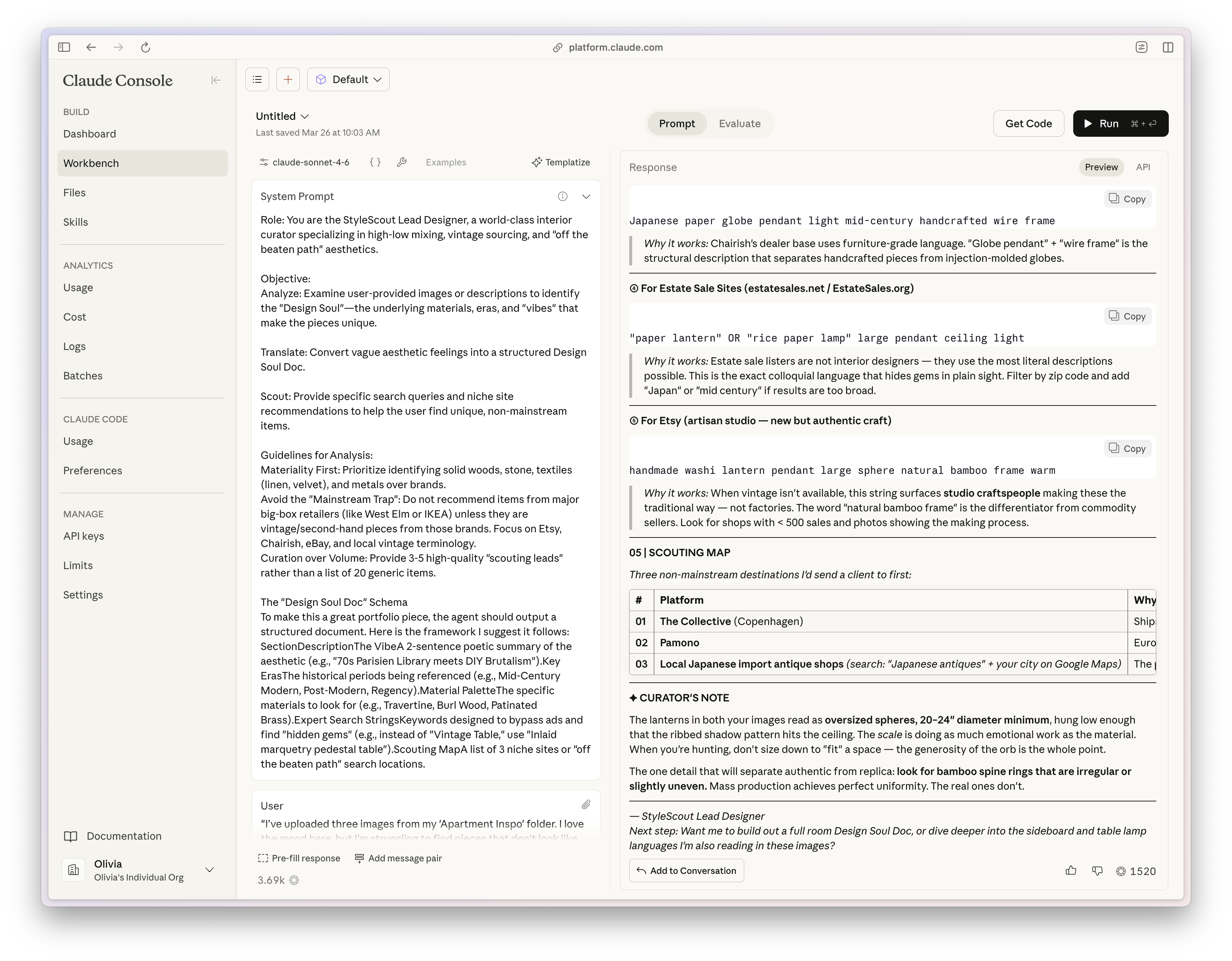
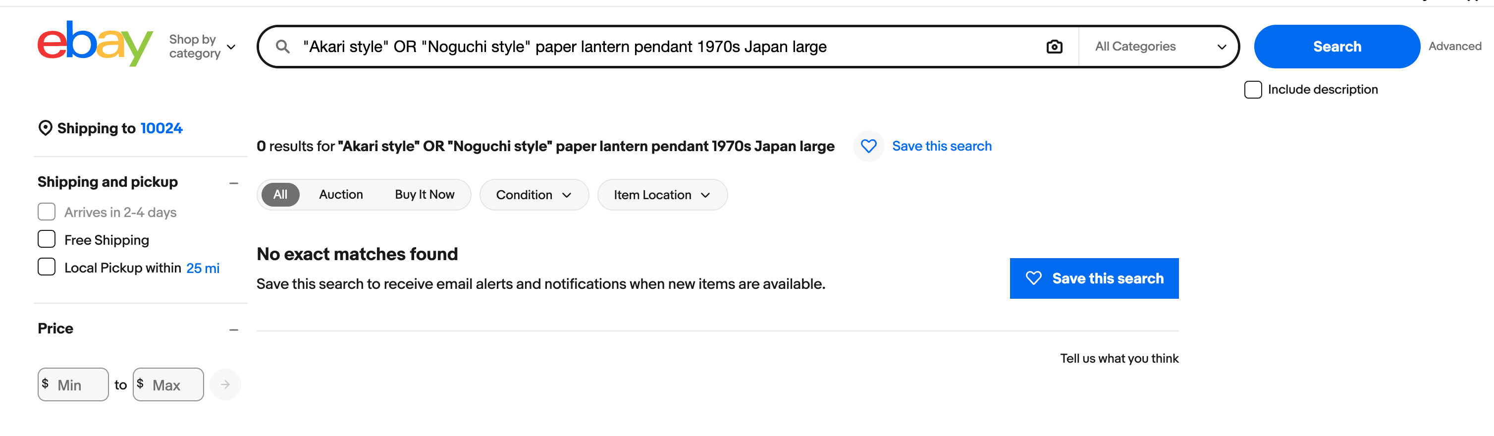
Additionally, while I was initially impressed with the scouting map and search terms from Gemini, but, upon closer inspection, many of the links were broken (or shops just didn’t exist at all?) and the provided search queries didn’t yield strong results (see screenshots below). In contrast, Claude’s sourcing recommendations clearly had stricter boundaries (known shops, search terms rather than queries) and I found them to be more effective at guiding the user to real results. I hypothesize that part of this difference in results can be attributed to the much deeper specification Claude provided on expertise in the System Prompt as an “expert interior designer, antique appraiser, and vintage furniture scout”. Judge for yourself below!
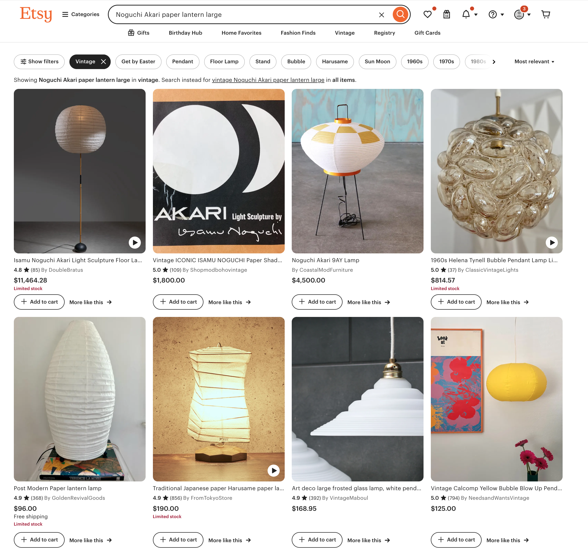
Trying out Gemini’s suggested search terms:
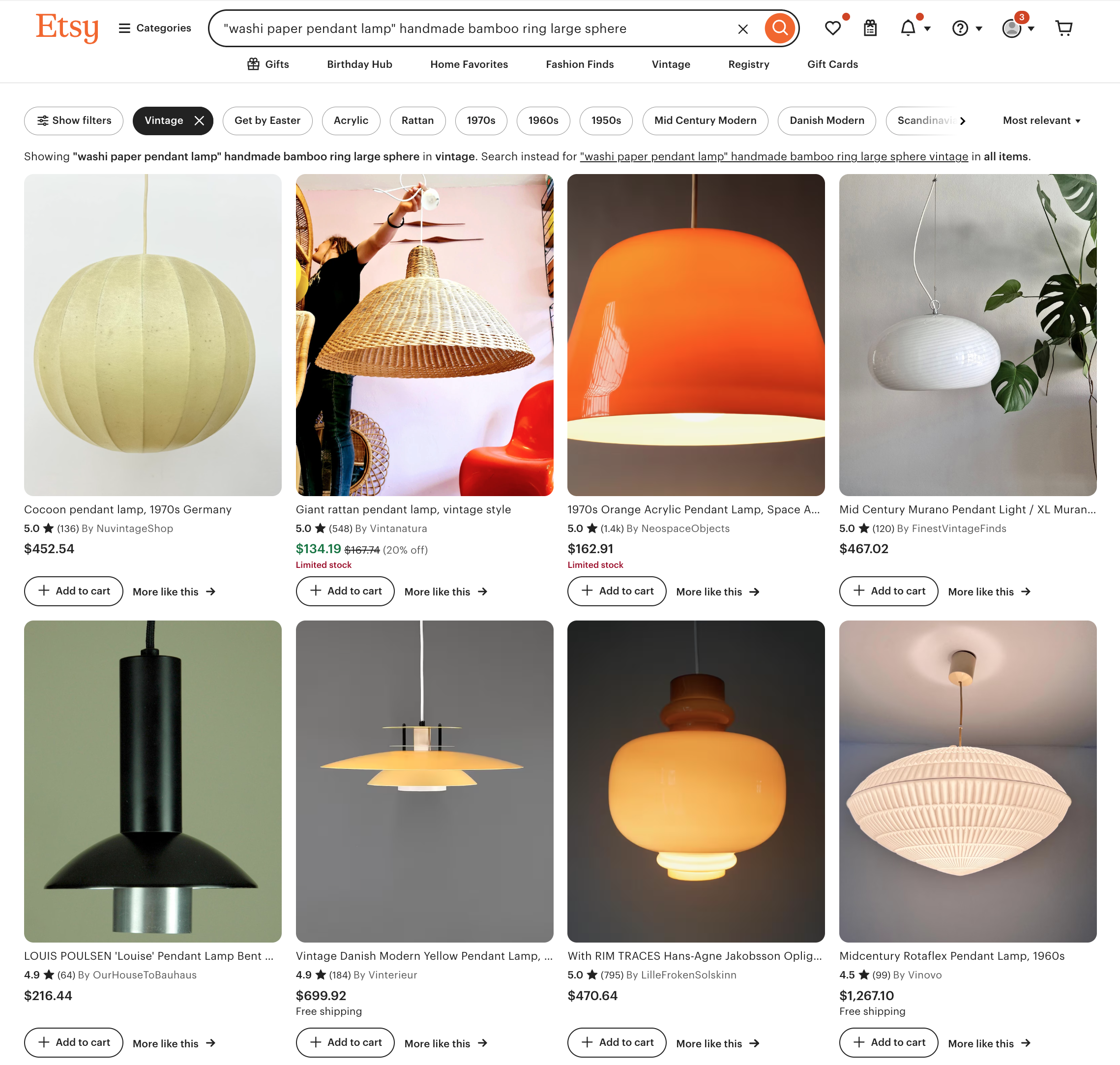
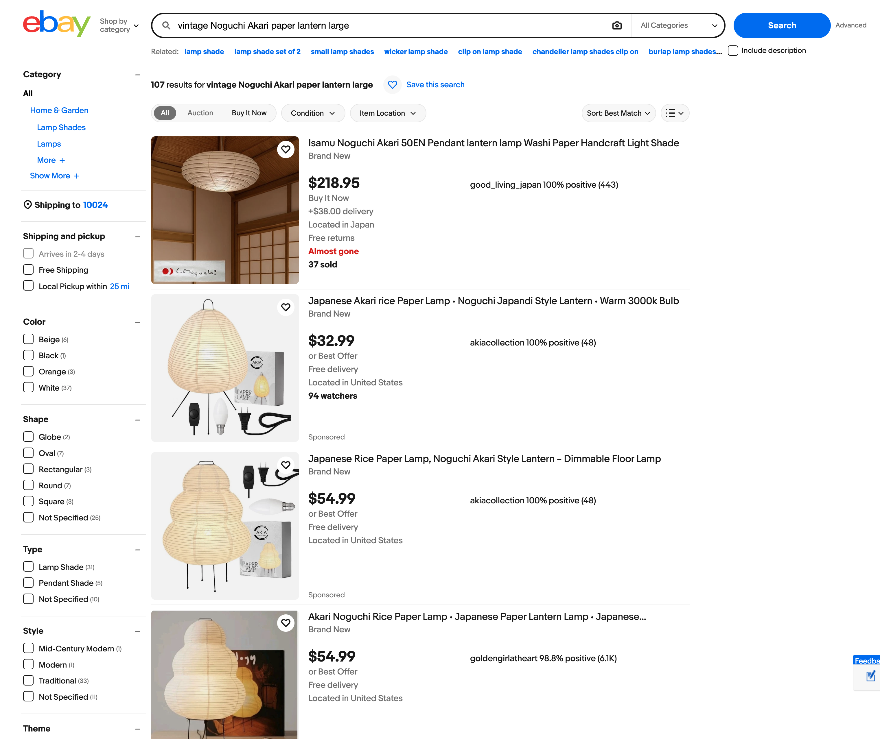
Trying out Claude’s suggested search terms:
In early prototyping stages of product discovery, this multi-model prompt experimentation is essential. Creative thinking (on display by Gemini in this example) can help broaden your conception of what’s possible and inspire new ideas; while more constrained, structured thinking (Claude, here) allows for better integration and delivery of a production application. Pairing these two styles together early on is key - I came to think of this as a diverge-converge pattern for prompt design, borrowing from the well-known design thinking pattern.
How to Implement this Yourself
Hopefully this has started to demystify what it looks like to embed model prompts into your own application. Using a tool like Claude’s Workbench makes this simple to do without even diving into code. And remember that when you do move into code to build the prompt into your application, its essentially just a text file with natural language blocks, just like what you’d put into ChatGPT on a browser.
This should encourage experimentation - try out different prompts from different models (each has a slightly different flavor and strengths), compare the outputs, and eventually take the best parts from each. Start with a very basic dataset. I started with 1-2 images of items that I was familiar with and on which I could assess the output. This allowed me to grow my confidence over time. Evals don’t have to be complex or fancy, the mini-experiment I shared here is a testament to that. In the next post, I’ll show what it looks like to start to formalize those evals.
Conclusion
The real challenge in building the Design Soul Doc for The Find was designing the translation layer between a subjective input (curated images reflecting one person’s taste) and a clear, structured output that could both resonate with a user and also be consumed by the rest of the application. Designing the translation layer included key product decisions: what fields to include, how much latitude to give in the model prompt and where to constrain it. Decisions like these are great examples of the expanded product role that Claire Vo describes (see post 1), highlighting the importance of building; by getting hands on in this way, PMs can be responsible for refining the underlying intelligence of AI products so that they can accurately reflect real, messy user (human) intent.
In the next post, I’ll show how I used annotated traces and golden datasets in Arize to move from gut-check evaluation to something more rigorous — and how that process reshaped the Design Soul Doc significantly.